This print is designed to be printed and displayed at 32″x48″. The Pre-2016 version is also available at 24″x36″, but please note that at the smaller size the text, though legible, is significantly smaller.
The Pre-2016 version only includes presidents up to Obama.
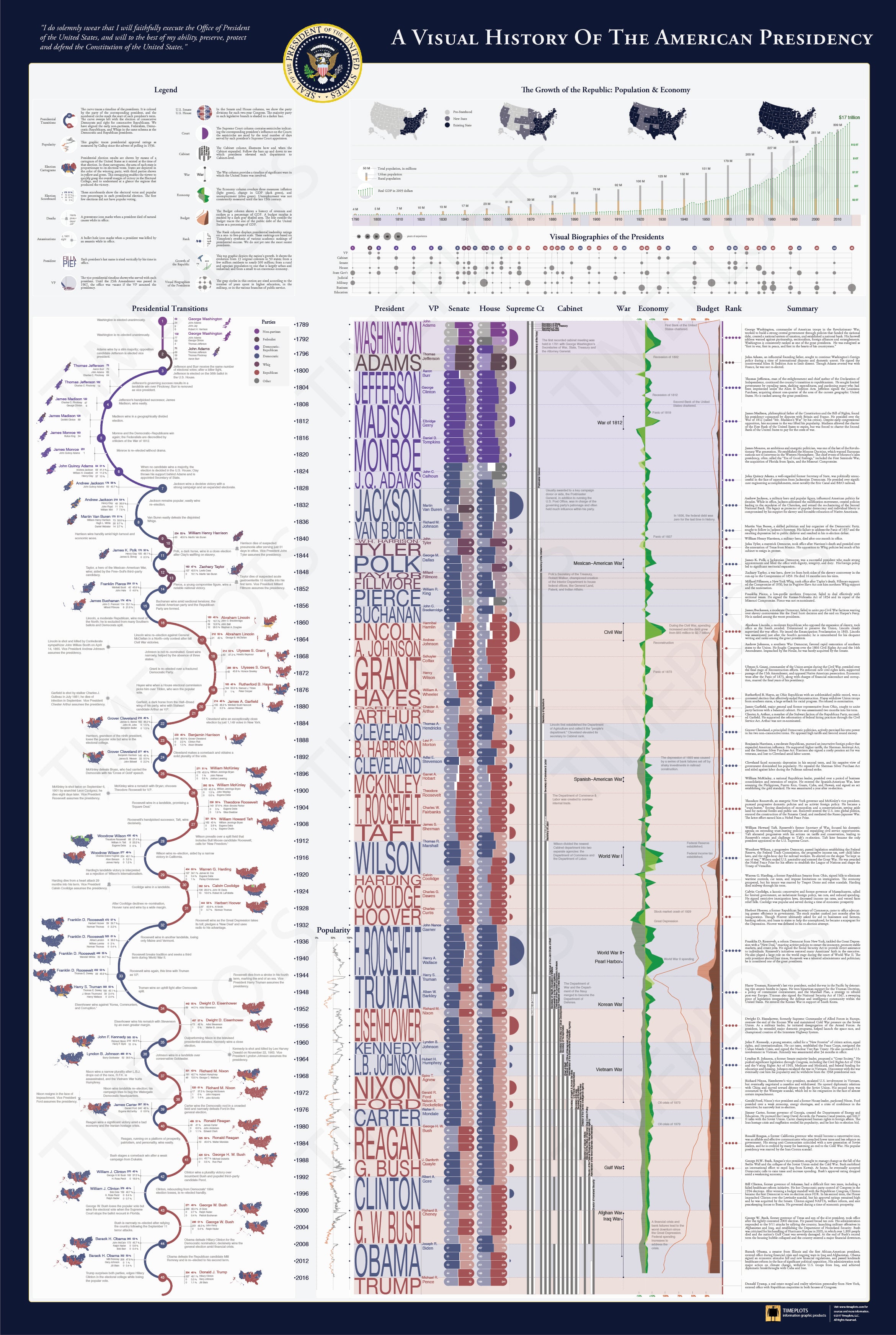
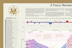
This large-scale print is like nothing else available on the history of the American presidency. It places each president in historical context, visualizing a remarkable range of political, social, and economic measures to succinctly tell the story of the presidency. Narratives are displayed within the larger context of American political history by aggregating and annotating hard data on population, presidential elections, Congress, the Supreme Court, the Cabinet, the U.S. economy, and the federal budget and debt. The Timeplot provides a new lens into American political history; it is not intended to be absorbed at a glance, but rather to be visited and revisited over time.
Because we take pride in our work, we are pleased to offer our customers a premium product: the Timeplot is printed on highest-quality 100-lb archival paper and measures a full 48 x 32 inches, much larger than a standard wall poster.
The printing process is certified “green” by the Forest Stewardship Council and uses elemental chlorine-free paper.
what others say:
“Extraordinary work.”
- Richard Saul Wurman, creator of the TED conferences and coiner of the term “information architect”
“There are infographics — and there are *infographics.* Count this in the latter category…. It’s filled with an entire book’s worth of information…. Brilliant, brilliant stuff.”
- Cliff Kuang, FastCompany.com
“Amazing, I love it!”
- Nigel Holmes, information designer & author of graphic/information design books; former Graphics Director, Time Magazine
“Dude, it’s hot!!”
- Nicco Mele, Co-Founder and Partner at EchoDitto, Internet Operations Director of Gov. Dean’s presidential primary campaign in 2003
“It’s beautiful!”
- Todd Cavalier, Executive Director, Senior Creative Director, Informatics Studio
“Very cool, man!”
- Josh Ross, managing partner, Trilogy Interactive, Internet Director at Senator Kerry’s campaign for President in 2004
“Love it. The White House should get and display one.”
- Blake Zeff, BerlinRosen Public Affairs; New York Communications Director, Obama for America; Spokesman, Hillary Clinton for President
“Distilling all of the political, economic, and historical information that this poster has to offer is an amazing achievement. Presenting that information in such a useful, intuitive, and beautiful way is even more impressive. It’s a must-have for anyone interested in presidential politics.”
- Jeffrey B. Lewis, Associate Professor Department of Political Science, University of California Los Angeles
“Cool stuff! The perfect gift for political junkies.”
- Mark Sullivan, Founder, Voter Activation Network
“It’s great! See the counterpoint among national evolution along key fiscal, demographic, and size-of-economy dimensions, presidential history, the development of the cabinet, and configurations of party control of national government.”
- Rick Valelly, Professor of Political Science, Swarthmore College
“People who love American politics will love this. Tremendous work.”
- Sarah Slobin, infographics editor, The Wall Street Journal (formerly of The New York Times & Fortune Magazine)

